A Poster at a Glance: Reading the Order of Attention
Read an event poster at a glance by tracing what catches the eye, then checking whether date, venue and practical details are easy to find.
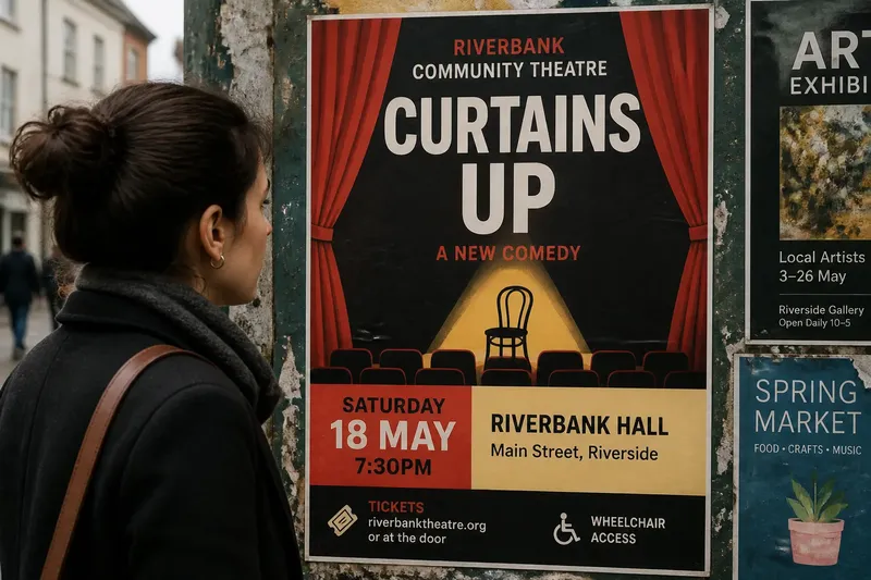
An event poster succeeds at a glance when a passer-by can identify the event and locate its date without hunting. Reading an event poster at a glance means tracing the order in which its headline, date, venue and supporting details reach you—not simply deciding whether the design looks attractive.
Stand back from the page, or shrink it on screen until the small type becomes indistinct. Notice what remains legible and what draws your eye first. Then read the poster at its actual size. These two views reveal different things: the first shows the broad hierarchy; the second shows whether the useful information survives close attention.
What catches your eye first?
Start with the first element you notice, before consciously reading. It may be the event name, a performer’s image, a vivid color block or a large date. There is no universal right answer, but the first element should give a passer-by a useful foothold in the event.
For a concert poster, a prominent band name may be the natural entry point. For a neighborhood craft fair, the event type might matter more. Ask what a stranger needs to recognize before deciding whether to stop and read. If a decorative shape or sponsor mark leads instead, the hierarchy may be spending its opening moment on the wrong subject.
Look at scale, contrast and position together. A large word near the top can still recede if it has little contrast against its background. A smaller date can become hard to miss when placed on a bright, isolated block. Attention is not a queue controlled by font size alone; it is more like objects arranged on a desk, where the item nearest the edge and easiest to grasp often gets picked up first.
Does the headline identify the occasion?
Read the headline as a person who has no prior knowledge of the event. Does it name the occasion, or does it offer only a slogan? A phrase such as “After Hours” may create mood, but without a nearby event type or venue it may not tell a stranger whether this is a film screening, a gallery opening or a late-night sale.
Notice how the headline relates to supporting text. A subtitle can supply the missing context, but it needs a clear visual connection: proximity, consistent alignment, or a shared background. If a viewer must search elsewhere on the poster to discover what the headline refers to, the design has separated information that belongs together.
Also check whether the headline’s scale overwhelms the occasion’s identity. An event series might use the same dramatic title treatment on every poster, while changing the event name and details. That can build recognition for the series, but the individual occasion still needs enough prominence to distinguish this poster from its siblings.
Can you find the date and venue quickly?
After identifying the event, look for the date and venue without reading every line. These are the poster’s practical anchors: the date tells a viewer when to act, and the venue tells them where. Their placement need not be identical, but they should feel like information of comparable importance.
Check for visual grouping. A date split across lines, a venue name detached from its address, or a time tucked beside a sponsor logo can make the details seem unrelated. A simple block can keep event name, date and location together, while distinct type sizes preserve their order inside it.
Compare the date’s visibility with the headline’s. A large title above a tiny date may work for an exhibition that remains open for a long period, but it is less helpful for a one-night performance. The occasion’s timing should influence the hierarchy. If missing the date would make the poster useless, that detail should not behave like a footnote.
Where do supporting details belong?
Supporting information includes the start time, ticket instructions, admission notes, accessibility details, age guidance and sponsor credits. It can be quieter than the event name, but “quieter” is not the same as hidden. Look for an intentional path from the essential information to the details that resolve practical questions.
One useful reading order is: what is happening, when and where, then how to attend. A QR code or short web address can carry extra information, but the poster should still identify the event and its location without requiring a phone. A code without a nearby explanation is a small square asking for trust without offering much context.
Check that secondary elements do not masquerade as primary ones. A sponsor logo may be visually strong because of its own colors or proportions. The designer can contain it in a separate area or give the event details stronger contrast, so acknowledgment does not accidentally outrank the invitation.
What should you check when reading an event poster?
Can you name the event from the first glance?
Look at the poster briefly, then describe what it advertises. If you can recall only a mood, image or slogan, the event’s identity may be too remote from the dominant element.
Can you locate the date without following a long trail?
Scan from the headline to the timing information. If your eye has to cross unrelated text or decorative details, the date may need a clearer position or a closer grouping with the event name.
Is the venue unmistakable?
Check whether the venue name reads as a location rather than an organizer or sponsor. An address, neighborhood or building name can clarify the destination when the venue itself is unfamiliar.
Can you tell what action the viewer should take?
Look for a plainly worded cue such as where to get tickets or whether entry is open. If no action is needed, the poster can simply provide the practical details rather than inventing urgency.
How does the viewing situation change the reading?
A poster seen from across a hallway has different demands from one held in a hand. At a distance, the headline and broad color structure do most of the work. Close up, the viewer should be able to find the venue, time and attendance details without deciphering a dense block of fine print.
Imagine a community theater poster viewed from the far end of a library corridor. Its title and an image of a stage curtain stand out, but the date disappears into a narrow line at the bottom. If the date were moved into a distinct block beside the venue, a passer-by could recognize both the occasion and its timing before deciding to approach. The example is invented; the observable question is simple: which essential fact vanishes first when the poster gets smaller?
Consider where the poster will be placed, too. A notice on a busy café counter may be seen at close range, while one in a station corridor competes with signs and movement. This does not mean every poster needs oversized type. It means the designer’s intended reading distance should match the way the event will actually be encountered.
What changes when the poster is viewed on a phone?
A phone view can expose weak hierarchy because the full design is compressed into a small screen. At thumbnail size, look for the event identity and the date. If only the image remains recognizable, the poster may depend too heavily on visual atmosphere.
Open the image at a comfortable reading size and inspect the details. Some information may be intended for a closer view, but essential facts should not depend on zooming into an awkward crop or guessing at low-contrast text. A poster shared digitally may also be separated from its caption, so its central facts should remain on the artwork.
When reading an event poster at a glance, finish by checking whether the eye’s path matches the viewer’s likely questions: what is it, when and where is it, and what should I do next? If those answers appear in a sensible order, the composition is doing more than catching attention; it is helping attention arrive somewhere useful. A passer-by may still keep walking, but at least the poster has made a fair introduction.