Why Letter Spacing Changes the Pace of a Page
Letter spacing changes how quickly a page reads by shaping word recognition, line texture, and the balance between type size and visible gaps.
Letter spacing changes the pace of a page because readers recognize words as shapes, not as isolated characters. In typography, a small adjustment to the gaps between letters can make a heading feel measured or urgent, while the same adjustment in a paragraph can interrupt reading. The effect depends on type size, letterforms, and the words on the line.
What does letter spacing actually change?
Letter spacing is the consistent addition or removal of space between characters. In design software, it is often called tracking. It differs from kerning, which adjusts the gap between a particular pair, such as the diagonal A and V in a large title. Tracking changes the overall texture; kerning handles local awkwardness.
Adding space makes the outline of a word less compact. At a glance, letters become easier to distinguish from one another, but the word’s overall shape becomes less familiar. Remove too much space and adjacent forms crowd together; add too much and the reader has to assemble the word letter by letter. Neither extreme is inherently elegant. Both make reading do extra work.
The pace here is visual rather than literal. More open lettering can slow the eye by making each character boundary prominent. Tighter lettering can make a short display phrase feel dense and quick, but in sustained text it may blur word shapes and slow recognition instead. The page’s reading speed is not a dial controlled by tracking alone.
Why does type size change the right spacing?
Letter spacing is perceived in relation to the size of the letters. A gap that looks generous in a large headline may disappear in small text; a setting that looks restrained at headline scale may pull a small label apart. That is why tracking values should be judged at the size and output conditions where the type will appear, not by the number in a software panel.
Large capitals often benefit from a little extra room. Their flat tops and repeated vertical strokes can form a dense, fence-like band, especially in short all-cap labels. Opening the spacing gives those forms clearer edges. But capitals already occupy more width than lowercase words, so the added space can turn a compact heading into a long, slow sign. A short label can tolerate that; a long sentence usually cannot.
Small text has a different problem. Its counters—the enclosed spaces in letters such as “o” and “e”—and its joins are already difficult to see. Loosening the letters may separate them, but it also stretches words and weakens their familiar silhouettes. Typeface design matters: a sturdy sans serif, a delicate serif, and a narrow condensed face do not respond alike. Treat spacing as a visual adjustment, not a universal correction.
How do the words themselves affect spacing?
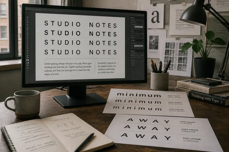
Some words expose a spacing decision more clearly than others. Repeated vertical strokes in “minimum” can make a line look crowded; diagonal forms in “away” create a different rhythm. Punctuation also matters. A comma or apostrophe occupies visual space without behaving like a full letter, so even tracking can make its neighbors seem oddly detached.
Word length affects the page as well. Added tracking accumulates across a long word and can widen a line enough to change its wrapping. In a paragraph, that shift may leave a short final line or create a conspicuous gap in a justified column. Conversely, tightening a heading to keep it on one line can make its letterforms collide or its word shape look pinched. Check the actual phrase, not a sample of repeated letters.
Imagine a designer setting the invented navigation label “STUDIO NOTES” in a large all-cap sans serif. The initial version looks like a dark strip beside the other menu items. The designer adds a modest amount of tracking and checks the full label at its final display size; the expected result is clearer separation between the repeated strokes without making the phrase feel like two disconnected words. If the label then wraps or loses its relation to the neighboring items, the spacing has gone too far for that setting.
When should you loosen or tighten the letters?
Loosen tracking when the type is large, especially for short uppercase labels whose strokes run together. It can also help a compact display line feel less heavy against nearby open space. Tighten cautiously when a large title feels scattered or when its word shape has lost coherence. In either case, adjust by small increments and compare the result at normal viewing size.
For body copy, begin with the typeface’s intended spacing. The designer has shaped its proportions and default gaps for ordinary reading. If the text looks cramped, check the font size, line length, weight, and line spacing before changing tracking. A line set too long can feel tiring even when every letter is beautifully spaced; tracking cannot repair a paragraph with poor measure.
Think of spacing like room between chairs: enough room lets people move, but excessive distance makes conversation awkward. The analogy has limits, since letterforms are not furniture, but it captures why more space is not automatically more legible. Readability depends on the pattern readers can recognize, not merely on visible separation.
What should you check before settling on letter spacing?
Does the word still read as a familiar shape?
Look at the whole word before inspecting individual gaps. If you notice a string of separate characters rather than a recognizable word, the tracking may be too open for that size and typeface.
Do repeated letters form a dark patch?
Check words with repeated stems, such as “minimum,” alongside the actual text. If the strokes merge at ordinary viewing size, a slight increase may help, but a different typeface or weight may be a cleaner fix.
Has the line wrapping changed?
Compare the paragraph before and after adjustment. If tracking creates awkward short lines or breaks a phrase in an unhelpful place, revisit the spacing or the measure rather than forcing the original line ending.
Does the setting work at its intended size?
Inspect a heading as a heading and body copy as body copy, including a screen or print preview if that is where readers will encounter it. A setting that looks polished when enlarged on a monitor may feel loose or cramped in its actual context.
How can you judge the rhythm without overworking it?
Compare a few restrained versions side by side, using the real words and the same type size. Step back far enough to see the line as a band, then return to normal reading distance. At a glance, notice whether it feels congested, scattered, or even; while reading, notice whether the eye can move across the words without pausing to sort out their letters.
Keep the distinction between display type and running text in view. A title may use open tracking to create a calm, deliberate beat, while the paragraph below remains close to the typeface’s default. That contrast is not inconsistency if each setting serves its role. Letter spacing changes the pace of a page most effectively when it responds to the words, the size, and the reader’s task—not when every line is given the same decorative treatment.